News about fonts...and stuff
![]()
Updated: 2/14/02; 0:08:49.
![]() Wednesday, February 13, 2002
Wednesday, February 13, 2002
![]()
|
11:26:36 PM
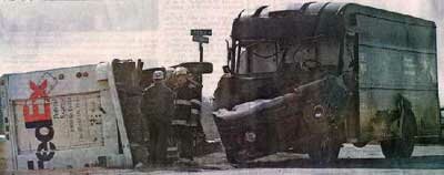
A picture is worth...
|
|
5:21:27 PM
Handspring's Treo 180 Palm organizer slash mobile phone slash wireless web device is now shipping.
|

|
2:03:51 PM
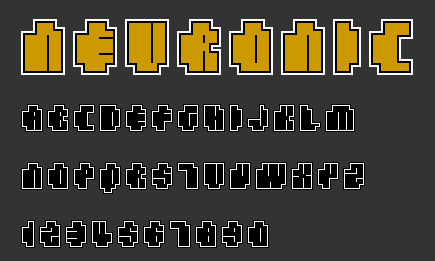
It's called Neuronic. Kind of "in your face" typography.
Coming very soon! |
|
1:14:41 PM
Have got this page running from the server with just a minor hitch - let's see how it goes! |
|
12:15:28 PM
The guy running Fontosaurus Text wants you to buy his fonts: "The one thing I hate to do right away is discuss money. I'm BROKE, so broke, in fact, that I am moving back home to live with my parents. They live 1200 miles away. I have been unemployed since October 9th, and am absolutely miserable without a job. I need donations of the money variety, for all these fonts you guys have been downloading. Why? Because I need gas money to drive that 1200 miles." |
|
12:29:53 AM
A review of my fonts in Spanish: Translated by Babelfish :( "This is an essential Web. Legible account with eighteen typographies for screen, lists to be used in designs for Flash, Web or Wap and to very small sizes. Typographies like the Genetica, comparable to Mini the 7, in capital letters, or the Quanta, a typography of right angles, more technological. Very reviewable it is the Scriptometex typography to be a calligraphic type with a very good legibility to a small size. Or the Microscopic, that with an only four height of pixels is another challenge to the legibility that here safe of skillful way. While, the Macroscopic, considers like a type with five different families, based on the height, without the width of the characters changes. Noir-Braille is perhaps most original as far as exposition: a technological typography and in bitmaps in braille, perhaps for when the screens are three-dimensional and sensible to the tact? Everything will be seen... In order to finish, in addition to the types Methodic, Atomic, Genetrix, Bionica, Joistik, Cellular, Remote, Monocule, Bilinear, Arachnid and Wired (attention to this one and what can do pixel floating over the characters), is a typography that curls the curl: the Megalon, that consists of Japanese characters. And it is that the assembly of the typographies of Average Atomic an exercise in the limit of the legibility represents everything. " |
© Copyright 2002 Matthew Bardram.
Last update: 2/14/02; 0:08:49.
| February 2002 | ||||||
| Sun | Mon | Tue | Wed | Thu | Fri | Sat |
| 1 | 2 | |||||
| 3 | 4 | 5 | 6 | 7 | 8 | 9 |
| 10 | 11 | 12 | 13 | 14 | 15 | 16 |
| 17 | 18 | 19 | 20 | 21 | 22 | 23 |
| 24 | 25 | 26 | 27 | 28 | ||
| Jan Mar | ||||||
Powered by: